
Another month, another T-SQL Tuesday. Next month’s will start during my pre-con at the PASS Summit, which will be interesting. It’s one thing to type during demos (and my pre-con will be demos from start to finish), but another to write a blog post. I’m sure I can have one pre-written – might give me something to do during the long flight from Australia.
This month’s T-SQL Tuesday is on data presentation, and is hosted by Robert Pearl. He waxes lyrical about the importance of presenting data in a meaningful way to clients, and I agree totally! It’s very important. In fact, I see it as such a fundamental thing that I had to think about what to write about.
A few months ago I spoke at a SharePoint Saturday event in Adelaide. I was a very late fill-in, and spoke about the importance of presenting data using effective visualisation techniques, and showed the differences between bullet charts, bar charts and pie charts. Apparently it made some people think, which probably wasn’t bad considering that I’d had very little time to prepare.
It’s been said many times before, particularly by people such as Stephen Few and Jen Stirrup, but pie charts simply don’t convey enough information. They are very popular, but they just don’t say enough. When I was studying in school, this was related back to entropy – or the Shannon entropy if you like. The Shannon entropy is all about the amount of information in a particular message, and ends up being very significant when considering how much data can be compressed.
If a picture’s worth a thousand words, then why I can’t paint what I like, and have it convey the same amount of information? Well, you can – but if your picture draws a pie chart, it’s probably a massive waste of the canvas. It simply doesn’t show as much information as a bar chart, which in turn, is less effective than a bullet chart. If I wanted to compress my dashboard, I’m sure the pie chart would compress further, as it doesn’t tell me as much.
But it’s not simply about the use of the space. White space can convey meaning too, of course. But data visualisation should be about, well, visualising the data. Pie charts only do that to a certain degree, and require a little too much skill in breaking down angles to be able to convert the visual back into data. The biggest piece of information that a pie chart conveys is “Yes, we do believe that these components add up a whole”, or maybe “Yes, I have successfully answered the questions about History and Geography correctly” if you’re playing Trivial Pursuit. If you want to know whether something is more than a sixth or less than a sixth, good luck! If you’re wanting to know how what the difference is between the third largest value and the fifth largest value, good luck! You simply can’t get at this information easily.
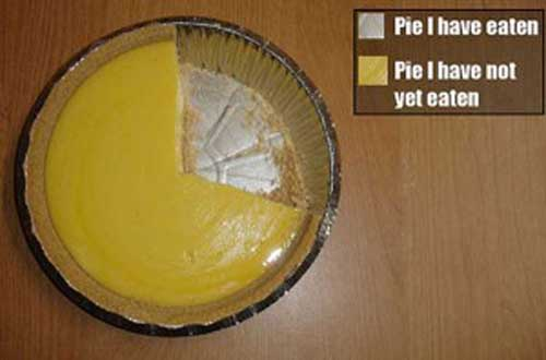
Here’s a picture showing how useful pie charts can be, from http://flowingdata.com/2008/09/19/pie-i-have-eaten-and-pie-i-have-not-eaten/. Can you tell what percentage of the pie is left? No, neither can I. It does look good though, I’ll give it points for that.


This Post Has 4 Comments
Here’s another favorite: http://www.flickr.com/photos/famewhore/291635623/
Come on Rob, are your eyes going bad? There is clearly 32.47% of that pie left.
Mr Fews book, Information Dashboard Design: The Effective Visual Communication of Data explains why pie charts are lousy really well. Its a great read for those of us who are less design astute.
Thanks Geoff & Aaron, that’s great.
And thank you too Steve. I’ve shared coffee with him before, and can thoroughly recommend his books to anyone who considers that pie charts are worthwhile. He’s back in Australia in November, but I doubt I’ll see him this time, as I don’t think Adelaide’s in his itinerary.