One of my favourite things about Power BI is its extensibility. For ages I would hear about how good some other self-service reporting platforms were, and how things in the Microsoft space were lacking. Power View, in particular, was frustratingly limited in what you could do with it, and I felt somewhat disappointed. It was good as a data exploration tool, but simply wasn’t a good reporting environment if you wanted something that was customisable.
But in recent times, Power BI has really stepped up, with custom visualisations offering the ability to extend capabilities much further.
I hadn’t explored much in the way of custom visuals in Power BI until a while back, even though I was very much aware of the competition that was held in September. It had been on my list to explore some of what was possible. And this month, the T-SQL Tuesday topic (hosted by Wendy Pastrick – @wendy_dance) was to learn something new and to blog about it. So it seemed a good idea to learn how to make my own custom visualisation!
Now, creativity isn’t exactly my thing. I find it really hard to write songs, for example. I know how to do it – but I quickly become self-critical and get stuck. Writing is easier, because it feels less ‘creative’, and appeals more to the teacher / preacher in me (and I know that takes creativity, especially if you’ve ever seen me present, but it’s different). So sitting down and coming up with a new way of visualising data wasn’t something I was going to do.
But I found the Synoptic Panel visualisation, which is actually the one that won the competition, and learned some of how to use this. This one lets you make your own visualisations based on your own images. It’s really neat.
There are two aspects to it.
1. The .pbiviz file. This is what you add as your custom visualisation to the Power BI Desktop. You can get it from the Power BI Visuals Gallery, along with a bunch of other cool visuals. It’s the one that looks like a room with lots of colours.
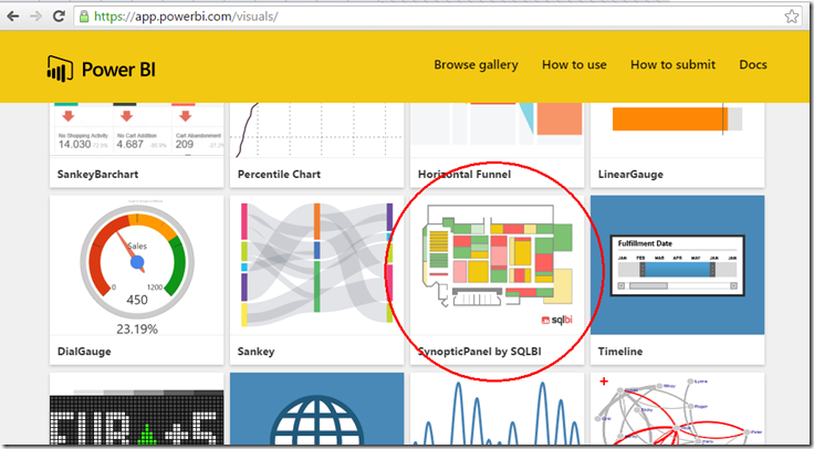
2. Your image, with a bunch of extra mark-up. This is where the magic happens.
You head over to http://synoptic.design/ where there’s a tool for creating it all. You drop in your image (I went with the LobsterPot logo, which was my own design, in a moment of creativity), and picking the “magic wand” icon, click on the various areas of your image.
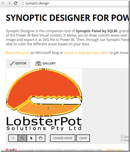
Here I’ve made just two areas, by clicking on the two parts of the logo. I can name them if I want, but already I’m pretty much done. There’s a big button on the right that says “Export to Power BI”, which lets me download an SVG file. Interestingly, I already had an SVG image of the company logo, but I needed the right markup, so I needed the exported one.
Now over in the Power BI Desktop tool, I wanted to see what this looked like. I started by importing the custom visualisation. I clicked on the ellipsis at the end of the “Visualizations” pane, and got the extra one added.
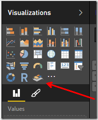
Clicking this to add it to my report, I got a window that looked like this:
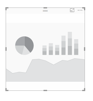
And I expected to see some way of getting my LobsterPot claw to display. No such luck. I clicked all over, and saw nothing.
But it turned out I just needed to add some data to it first. Once I’d done that, I got some options:
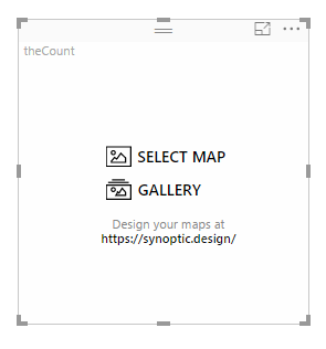
Hitting “SELECT MAP”, I could find my SVG file and I got my claw!
The data I had was just two values. I wanted to be able to colour each section a different colour. But the areas of my image were already red, so I coloured my areas in white, setting the saturation to be less for the higher colours (less white, therefore more red), and more for the lower colours (more white, so less red). I made a negative measure to help with this.
But quite quickly, I had my claw, with a value of 90 showing quite red, and a value of 50 showing a fainter pink colour.
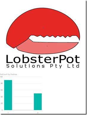
In hindsight, I should’ve edited my image before I started, making the two areas white, and then I could’ve easily coloured them in red. But in my exploration, I was able to learn some of the capabilities of this useful control (tip: read https://powerbi.microsoft.com/en-us/blog/visual-awesomeness-unlocked-using-the-synoptic-panel/), and I figure that the availability of this visualisation may mean that I never worry about creating my own from scratch.
I wonder whether I will one day come up with a visualisation of my own. Perhaps, although for the time being I’ll leave it up to the experts. I can use this one for all kinds of things, I suspect.


